Here’s something I learned after fifteen years of dragging paint swatches across Parisian apartments: most people choose bedroom colors backward. They pick what looks stunning at 2 p.m. when the sun hits the floorboards, not what soothes frazzled nerves at 11 p.m. when sleep refuses to come. But the data is increasingly clear that this decision carries measurable physiological weight. A late 2024 study conducted across November and December found that 38% of respondents reported improved sleep following a bedroom color change, evidence that hue/color selection transcends aesthetics and functions as a legitimate sleep aid.
The truth is, color selection isn’t just about design theory it is neurobiological. When you walk into a bedroom, your retinal ganglion cells fire signals that bypass conscious thought entirely, telling your adrenal glands to either stand down or stand ready. Specific wavelengths alter heart rate variability, cortisol production, and melatonin onset. Getting this right matters more than that perfect accent pillow and can lead to improved sleep.
The Neurobiology of Sleep-Optimized Colors
Color-induced physiological responses are quantifiable. Sleep-friendly interior design leverages mechanisms that create parasympathetic-dominant environments, which means you are literally convincing your nervous system that it’s safe enough to lose consciousness. Research demonstrates that cool, desaturated tones can reduce cortisol levels and lower heart rate variability, creating the precise physiological conditions for restorative rest.
But here’s where individual variation enters. While the science provides guardrails, personal history modifies response. I had a client from coastal Marseille who couldn’t tolerate blue walls because they reminded her of a childhood hospital ward. We used warm terracotta instead, and her sleep improved dramatically despite blue’s statistical superiority. So while the data provides starting points; your biology and biography write the final decision.
Blue: The Empirical Champion
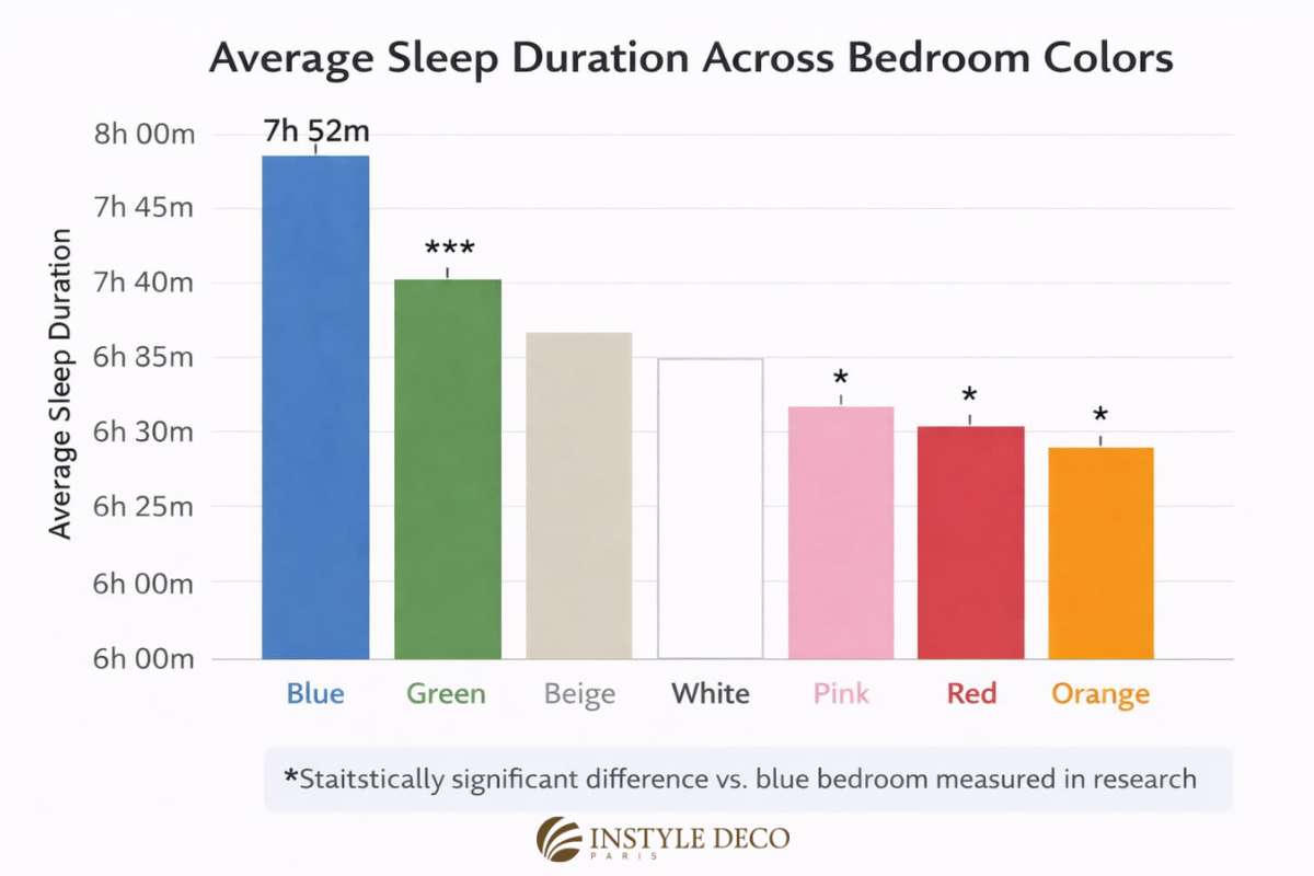
The research is robust and consistent. In 2013, Travelodge conducted a comprehensive study tracking 2,000 British households, measuring both bedroom color schemes and actual sleep duration. Participants in predominantly blue environments averaged 7 hours and 52 minutes of nightly sleep which was significantly more than those in purple rooms (5 hours 56 minutes) or other high-arousal chromas.
The mechanism involves evolutionary conditioning. Blue surfaces trigger associative responses with twilight skies and calm waters, activating the parasympathetic nervous system and reducing blood pressure. Academic research specifically identifies blue, alongside green, beige, white, and pink, as hues that demonstrably improve sleep architecture and impact physical health outcomes.
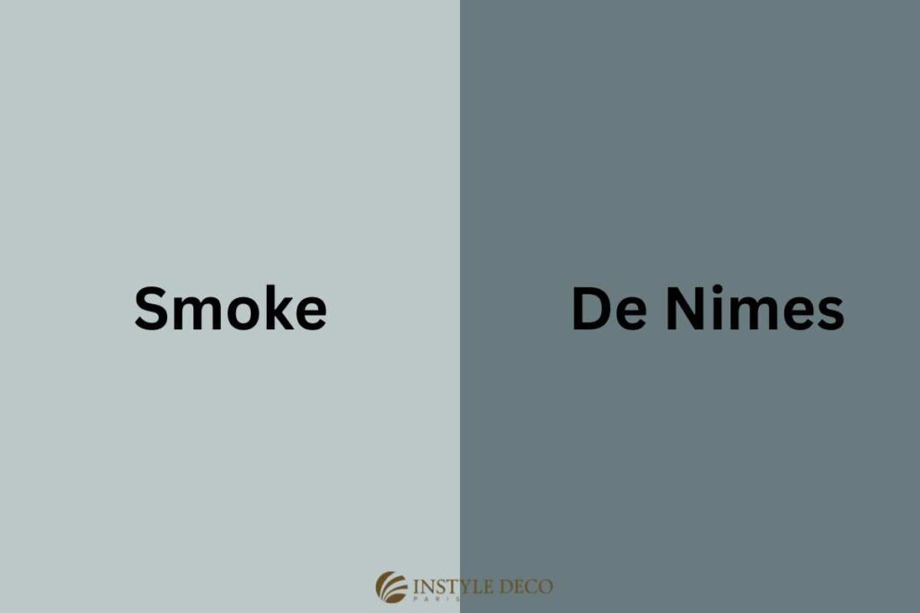
However, execution matters. It is shown mid-tone blues, so think Farrow & Ball’s “De Nimes” (a grayed blue with historical weight) or the denim-washed tones of Benjamin Moore’s “Smoke” work best (See image). Avoid electric blues that buzz with energy; you want the color of breath, not voltage so think more grey blues.
Green: The Circadian Regulator
If blue feels too cool or institutional, soft green shades like sage and muted olive offer measurable stress-alleviation while supporting circadian entrainment, which is related to the circadian rhythm or your internal clock, which dictates when you feel sleepy or awake. These natural tones effectively bring biophilic elements indoors, lowering cortisol levels without the clinical associations some attach to blue.
Green occupies the center of the visible spectrum, requiring no retinal adjustment when you open your eyes at 3 a.m. to check the time. Neuroaesthetic research suggests green environments reduce central nervous system arousal while maintaining cognitive clarity, simply meaning you wake sharp, not groggy.
In my practice, I specify Benjamin Moore’s “Cedar Key” or Farrow & Ball’s “Green Smoke” for clients who find blue too passive (see image). For 2026, we’re seeing particular interest in Little Greene’s “Sage Green” (Pantone 15-6316 territory) which is a complex, slightly gray, never minty green. This supports the broader trajectory toward warm taupes and muted blues that prioritize wellness over stimulation.

2026 Bedroom Design for Sleep: Data-Driven Palettes
Current design intelligence indicates a decisive shift away from the stark minimalism of previous years. Post-pandemic wellness priorities now demand sleep-friendly interior design that balances aesthetic neutrality with psychophysiological restoration.
Modern Minimalist: Muted Neutrals
The “white box” approach is dying, and not a moment too soon. Clinical stark whites reflect 85% of available light, forcing your eyes to work overtime. Instead, 2025’s best bedroom colors embrace earthy minimalism:
- Warm Taupes: Beige-gray hybrids like Farrow & Ball “Pointing” or Benjamin Moore “Swiss Coffee” reduce visual stimulation without coldness
- Soft Greige: “Revere Pewter” dialed back 20% lighter—combinations reflecting current preferences for grounded simplicity
- Muted Accents: Single hits of dusty blue or desaturated sage at 15% contrast ratio to maintain low arousal states
Traditional Elegance: Deep Tones
Classic European bedrooms handle deep color magnificently, provided you balance saturation with light. The key is matte finishes—eggshell or flat—to prevent light reflection that keeps eyes scanning instead of resting:
- Navy Blue: Saturated but not stimulating; pairs with cream and brass fixtures to maintain luminosity
- Forest Green: Grounding hue that reinforces natural associations without the aggression of brighter chromas
- Deep Burgundy: Acceptable only as limited accent walls, balanced with metallics to prevent somatic arousal
Chromatic Avoidance: What the Data Says to Skip
Just as specific colors promote rest, others demonstrably hinder it through sympathetic nervous system activation. While most design blogs banish red with biblical certainty, the physiological mechanisms are more nuanced:
| Color Category | Physiological Impact | Sleep Disruption Mechanism |
|---|---|---|
| Bright Reds/Oranges | Heart rate elevation | Stimulates amygdala activity; increases core body temperature |
| Vibrant Yellows | Cognitive arousal | Delays melatonin onset through high luminance values; too cheerful for sleep environments |
| Pure Stark White | Cortisol elevation | Clinical associations trigger stress responses; excessive light reflection prevents downregulation |
That said, proceed carefully rather than categorically. A deep burgundy accent wall behind a navy headboard in a north-facing room can feel womb-like and secure, despite red’s statistical arousal profile. Context—lighting levels, saturation, and surface area—modifies impact.
Evidence-Based Color Combinations
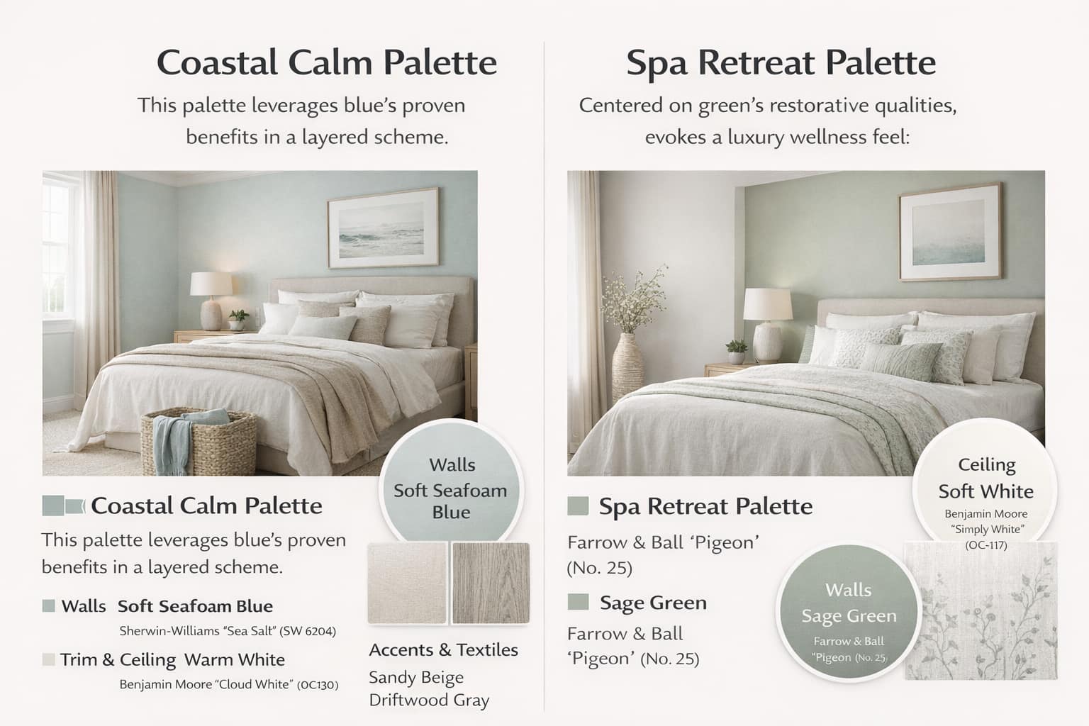
The Coastal Calm Palette
Forget the “beach house” clichés with rope mirrors. This is about atmospheric memory and physiological downregulation:
- Walls: Soft seafoam blue, saturated at 30-40% (Farrow & Ball “De Nimes” or similar grayed variants)
- Ceiling: Same wall color at 50% tint, extending six inches down onto walls to create infinite sky effect
- Trim: “Dimpse” by Farrow & Ball, a cool gray that doesn’t fight the walls, or warm white avoiding blue-white tones that mimic daylight
- Textiles: Unbleached linen, sandy beige, driftwood gray for tactile-visual coherence
The Spa Retreat Palette
For clients who wake at 5 a.m. with racing minds—biophilic restoration with grounding elements:
- Walls: Sage green (Little Greene “Sage Green” or Pantone 15-6316 variants)
- Ceiling: Soft white with 10% gray undertone to reduce glare; Benjamin Moore “Gray Owl” cut by half
- Woodwork: “Slaked Lime” by Little Greene for contrast without harshness
- Secret Weapon: One high-gloss black lacquer nightstand. The reflective depth grounds the space surprisingly well, preventing the “floating” feeling that can trigger anxiety in all-matte rooms.
Implementation Protocol: Testing Before Committing
That 38% improvement statistic? It depends entirely on environmental testing. Colors appearing restful in daylight may trigger alertness under LED spectra. Before full implementation, paint 24″x24″ swatches on north and south-facing walls, observing chromatic shifts across three time points: morning (8 AM), evening (6 PM), and artificial lighting conditions (9 PM).
Observe for three nights. If the color makes you reach for your phone to “check something quickly” rather than settling into your book, it’s wrong. Sleep-friendly interior design requires empirical validation, not just aesthetic preference.
The Quantified Case for Color
The evidence conclusively establishes that bedroom color schemes directly impact sleep architecture. With 38% of individuals reporting sleep improvements post-color change, and specific hues like blue yielding measurable increases in sleep duration (7h 52m average), chromatic selection constitutes a valid intervention for insomnia and sleep maintenance issues.
Last year, we worked with a musician in Paris’s 11th arrondissement who hadn’t slept through the night in three years. Her previous designer had installed an aggressive magenta feature wall, far too stimulating, “energizing,” and completely incompatible with her physiology. We stripped it back and layered instead a complex, moody blue-gray with violet undertones all custom mixed to complement her skin tone in morning light while triggering parasympathetic response after dark. She texted six weeks later: “First unbroken sleep since 2021.”
That’s the goal. Not magazine perfection, but physiological permission to rest.
At Instyle Deco Paris, we don’t do catalogues. Every palette we specify begins with a conversation about your specific sleep patterns, this means do you read for hours? Pass out immediately? Wake at intervals? Then it ends with custom-mixed samples applied directly to your walls, observed at dusk, at midnight, at dawn. Because the best bedroom colors aren’t just beautiful at 2 p.m.; they’re the ones that let you surrender to sleep when it matters most.
Ready to transform your bedroom into a statistically significant sleep sanctuary? Contact us for a personalized bedroom interior design consultation.