The psychology of colour is a fascinating subject in interior design. It is undoubtedly one of the core aspects of the interior design process and one that should not be overlooked. Different colours can used in a space to create different moods and atmospheres and is something we explore in how mood is effected by design.
Colour has been used in interior design since the very beginning. Modern design is mostly associated with white and black, but it is no stranger to colour either. Following the Art Deco period, modern design represented a break with traditional and exotic colours (like purple, jade, orange, black and gold) to embrace saturated primary colours. But the evolution of colour didn’t stop there. In the 1950s and 1960s, pastel colours like pink, blue, yellow and green became popular in home furnishings and design. And in the 1970s and 1980s, earth tones like brown, beige and tan became commonplace. Today, designers continue to experiment with colour in both traditional and innovative ways. As a result, colour is an important element of modern design that can be used to create stunning living space.
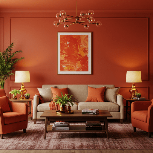
Colour is important in interior design because it can evoke different emotions
Colour is one of the most important aspects of interior design because it can have such a profound effect on our emotions. Different colours can create different moods and feelings, so it’s important to choose the right colour scheme for a space. For example, cool colours like blue and green tend to be calming and relaxing, while warmer colours like red and orange can be energizing and exciting. And depending on the intensity of the colour, it can also make a space feel bigger or smaller. So when you’re choosing paint colours or furnishings for a space, think about the mood you want to create and how the colour will affect the overall feeling of the room.
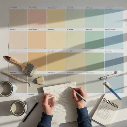
The psychology of colour
Colour psychology is the study of hues as a determinant of human behaviour. It is sometimes referred to as chromology (from Greek chroma, meaning "colour") or chromatics (from Latin chroma, meaning "colour"). Colour psychology is also sometimes associated with the field of optics. Given that colours can be perceived differently by different people, and can have different effects on mood and behaviour, it is important to consider how colour affects us before making design choices.
Colour psychology has been used in marketing and advertising for many years. Marketers use colours to influence our emotions and perceptions in order to create an association with their products. For example, red is often used to stimulate appetite, while blue is often used to calm and relax. In addition, certain colours can also have a specific meaning or symbolism. For example, red is often used to signify danger or warning, while white is often used to represent purity or innocence. By understanding the psychological effects of colour, we can use colour to create desired moods or atmospheres in accordance with client briefs. We can also use it to send subtle messages or convey important information.
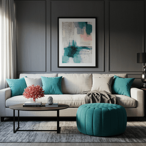
Examples of how to use colour in your home
Over the years there have been many different lines of thought and there is no right answer on how you should use colour in your interior design. However there have been trends and let's explore some of the more popular ones.
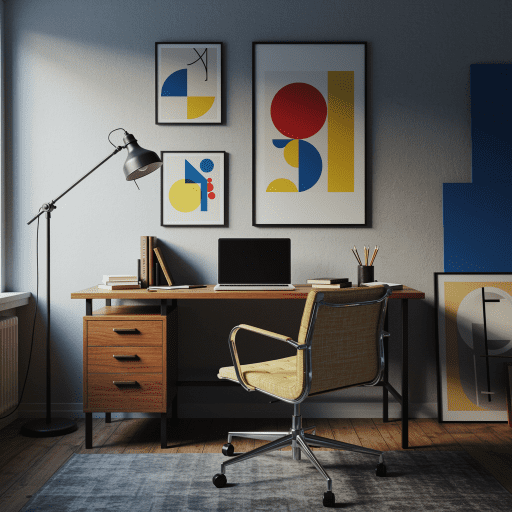
Bauhaus (1919)
The Bauhaus school is credited with inspiring the Modernist movement. The school emerged in 1919, and focused on bringing craft and art together, creating replicable forms, and prioritizing function. As for their colour theory, one of the school’s teachers, Johannes Itten, named seven fundamental categories of contrast: hue, light vs. dark, cold vs. warm, complementary colours (opposites on the colour wheel), analogous colours (three side-by-side colours on the colour wheel), saturation, and extension. The Bauhaus school's focus on simple forms and functionality has had a lasting influence on design.
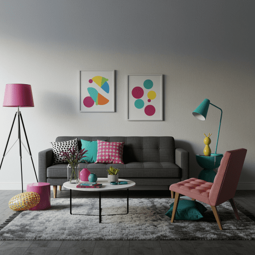
De Stijl (1917)
The De Stijl movement was founded by a group of artists in the Netherlands in 1917. The name De Stijl is Dutch for "The Style," and the movement was characterized by a focus on simple geometric forms and primary colours. De Stijl artists believed that art should be functional as well as visually appealing, and they sought to create a sense of harmony between form and function. One of the most famous De Stijl works is the "Red and Blue Chair" created by Dutch architect Gerrit Rietveld in 1918. The chair is constructed from primary-coloured geometric shapes, and it demonstrates the De Stijl philosophy of simplicity and functionality. Other notable De Stijl artists include Piet Mondrian.
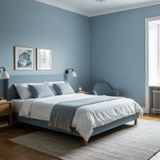
60s-70s
The 1960s were a time of colour experimentation, with new dye technology allowing for brighter, more vibrant colours. This concept continued into the 1970s, where it encountered innovations in technology toward the end of the decade. The rise of technology’s popularity and the ability of mass-production to meet demand ushered in the rise of industrial metals and synthetic materials in interior design. Metals were often left exposed, and the design era favoured minimalism and functionality.
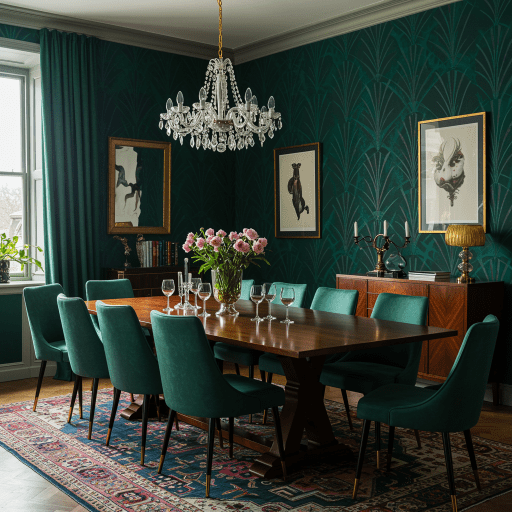
80s-90s
Memphis design was a movement that started in 1981 in Milan, Italy. In retaliation against the minimalism of the 70s, Memphis design embraced bright and radical colour, abstract shapes, richly-filled spaces, materials like terrazzo and laminate, and new prints like Ettore Sottass’s Bacterio.
The U.S. in the mid-80s also saw a return to opulence (elaborate fabrics, tasselled furniture and window treatments). Colour was used sparingly or in softer shades, but the boom in extravagance was short-lived as the economy tightened in the 1990s and opposition formed to the conspicuous consumption of the 80s, design became more humble and sustainable.
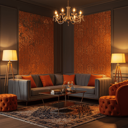
2000s-2010s
Design in the early 2000s was all about minimalism and simplicity. The return of natural materials such as wood and stone, combined with neutral colours, helped to create a calming atmosphere in homes. In recent years there has been a shift away from minimalism and toward designs that are more personal and unique. This has led to an increase in the use of colour, pattern, and texture in home design.
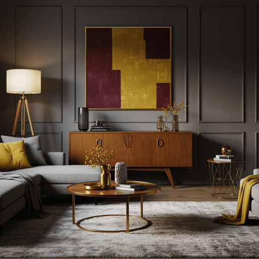
Consider the size, shape and function of the room when selecting a colour palette
The size of the room will affect the way the colour is perceived. Larger rooms can handle more saturated colours without seeming overwhelming, while smaller rooms benefit from light or pastel shades. The shape of the room also comes into play; long and narrow spaces tend to look best with cooler colours, while square rooms can handle a wider range of hues. The function of the room is also important to consider. For example, a dark colour in a bedroom can create a cozy and inviting space, while a light colour in a bathroom can make the room feel more airy and open. By taking all of these factors into account, you can select a colour palette that will perfectly suit your space.
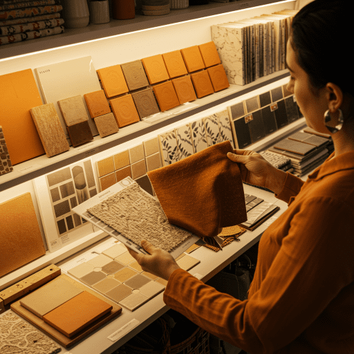
Different shades can be used to create different moods in a space
When you're choosing a paint colour, it's important to think about the shade as well as the hue. Different shades can create different moods in a space, so even once you know what colour you want, you need to consider the shade. As a rule of thumb; A lighter shade will make a room feel airy and open, while a darker shade will make it feel cozy and intimate. If you want a room to feel energetic and exciting, go for a brighter shade. If you want it to feel calming and soothing, go for a softer shade. And if you want it to feel dramatic and luxurious, choose a deep, rich shade. No matter what mood you're trying to create, there's a perfect paint colour out there for you.
With so many colours on the colour wheel, it can sometimes feel overwhelming to choose. That's why working with a professional interior designer can be a great way to narrow down your options and create a space that you love. At Instyle Deco Paris, we believe that every room should reflect your unique style. Whether you're looking for a bold new look or something more traditional, we can help you find the perfect colours for your home. We'll work with you to understand your vision and then provide a palette of options that will bring your space to life. Contact us today to schedule a consultation.